Dashboards & Storytelling

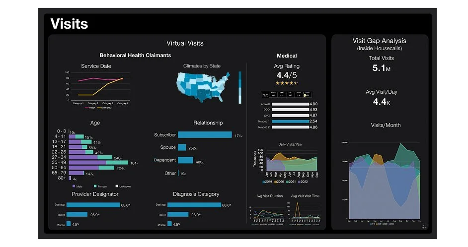
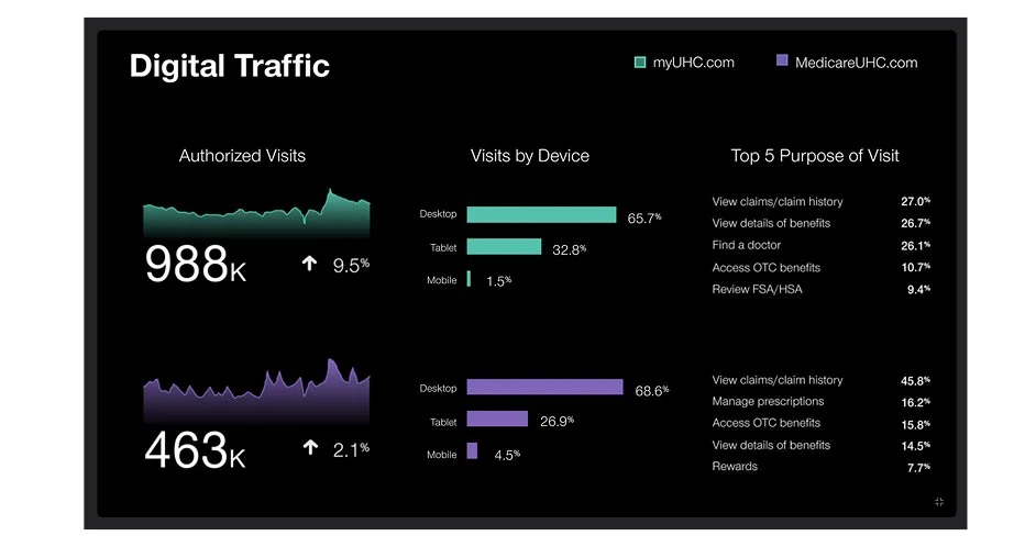
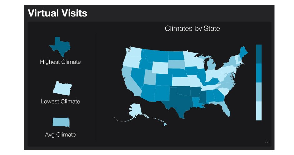
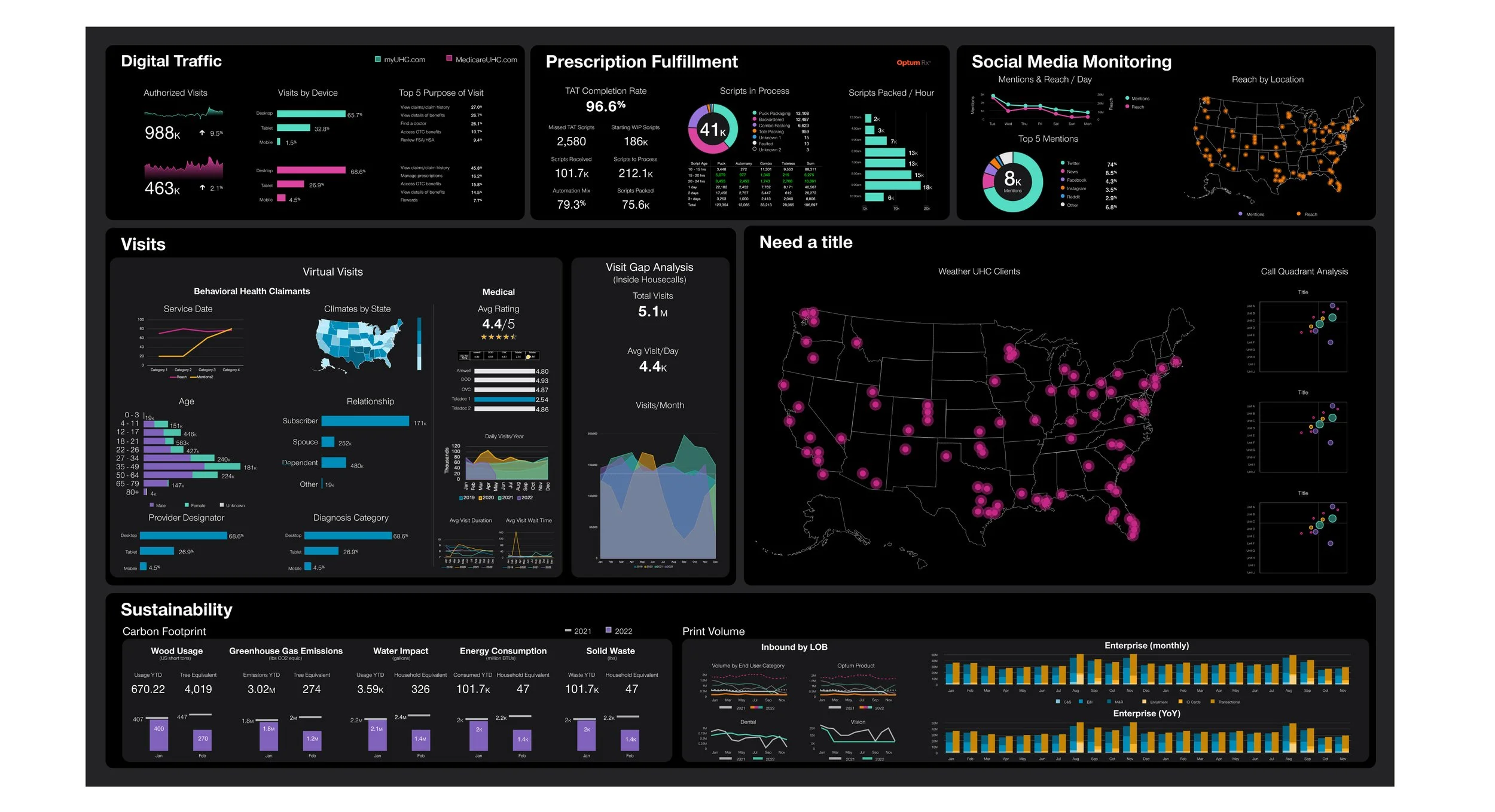
Optum Command Center Wall - measure the impact
A foundational enterprise capability that provides a holistic view of our key performance indicators, operational intelligence, work force management and performance monitoring. It encompasses a two story interactive visualization that displays up-to-date enterprise-wide metrics (Optum, UnitedHealthcare and UnitedHealth Group). Given the large scale of the display, it is important that we make the data as easy to view and comprehend as possible. Using color to highlight data insights and allow other supporting metrics to fade into the background.
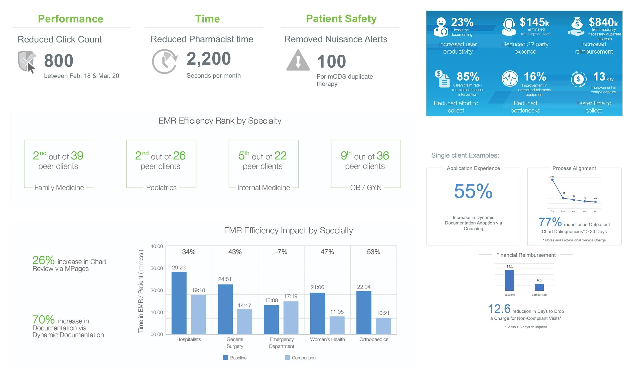
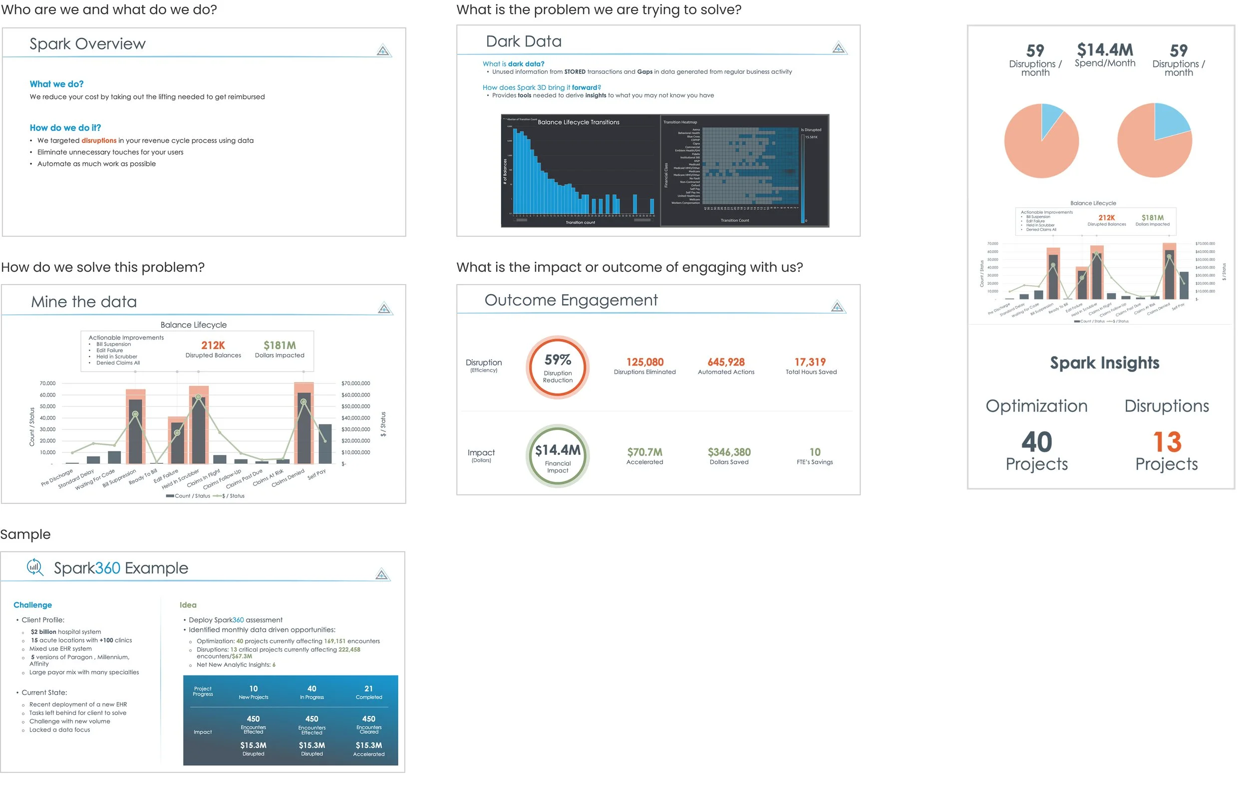
New Rev Cycle Company - pitch deck
Worked with founders, analysts, developers to create an easy to consume pitch deck that could be shared with perspective clients. I acted as a marketing and design resource to help them consolidate the company story and share their value to gain business from perspective clients.

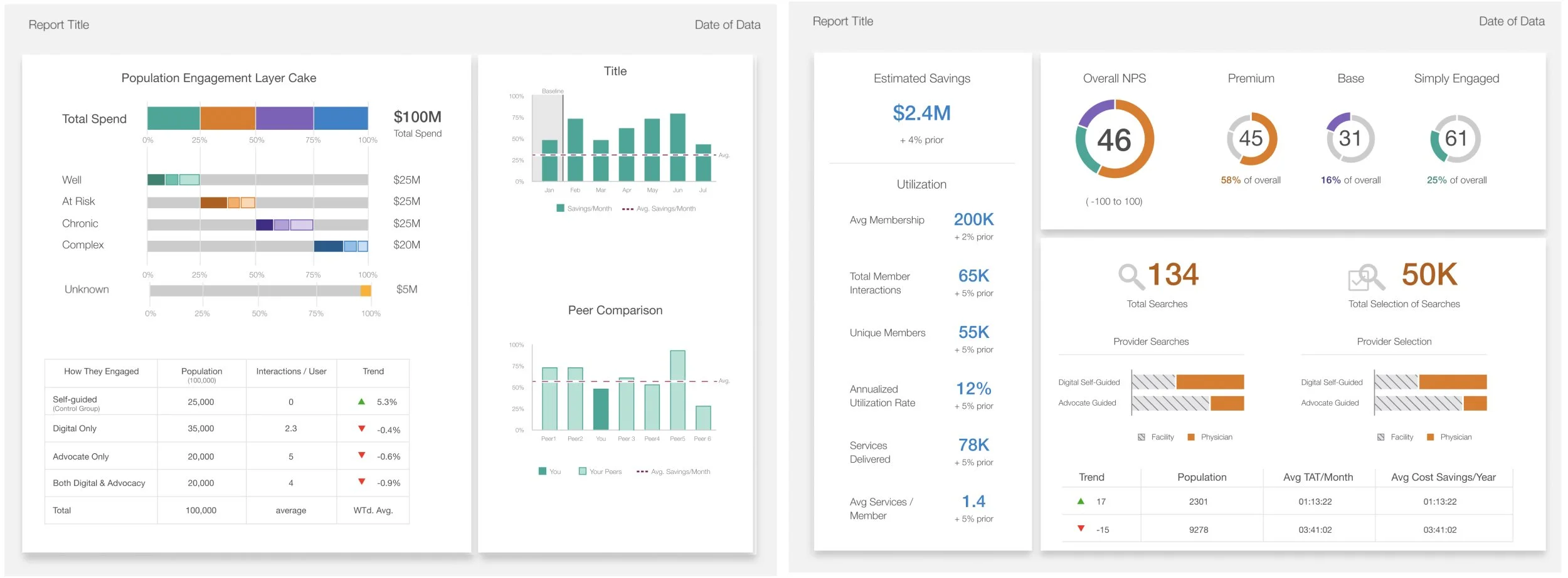
Report Standards - accessibility
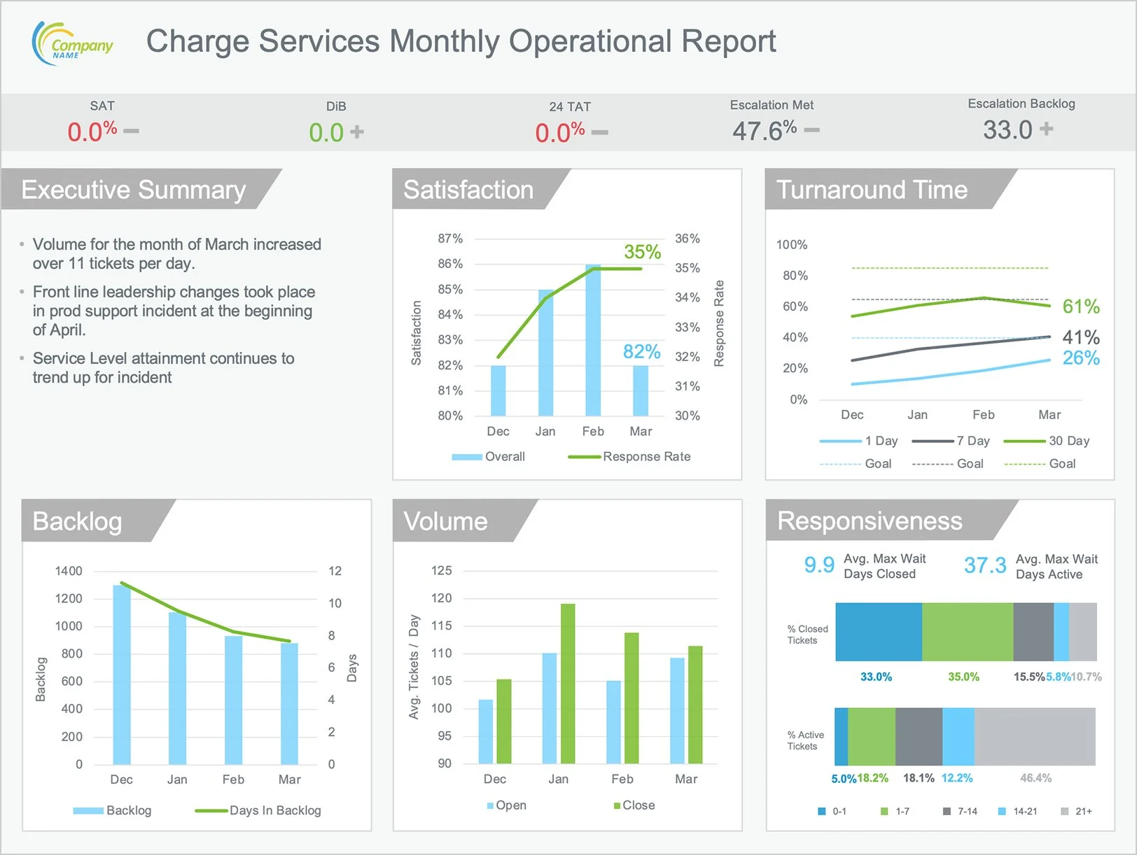
Used design principles and data visualization standards to create a cohesive and clean report.
Keep visuals clear and contrasted
Leverage white space
Use of pattern - Color cannot be the only visual way to convey meaning.
Labels make it easier for users to understand data visualizations by using text to reinforce visual concepts.
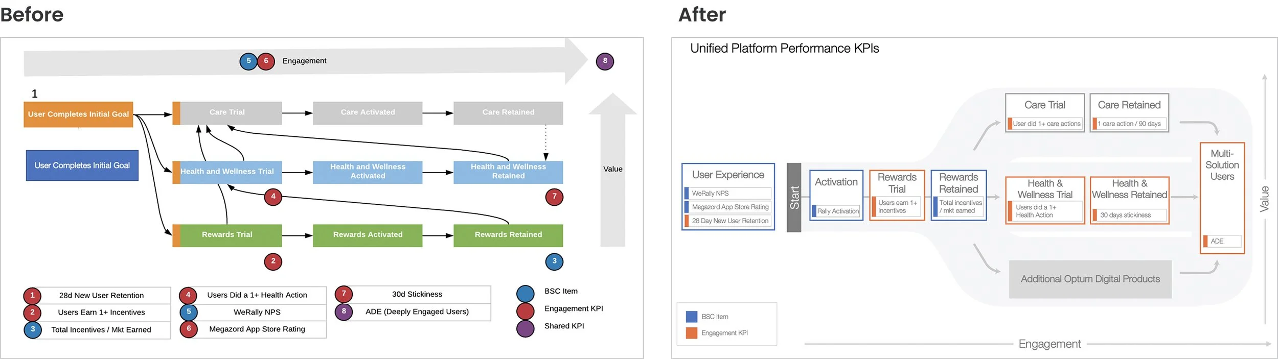
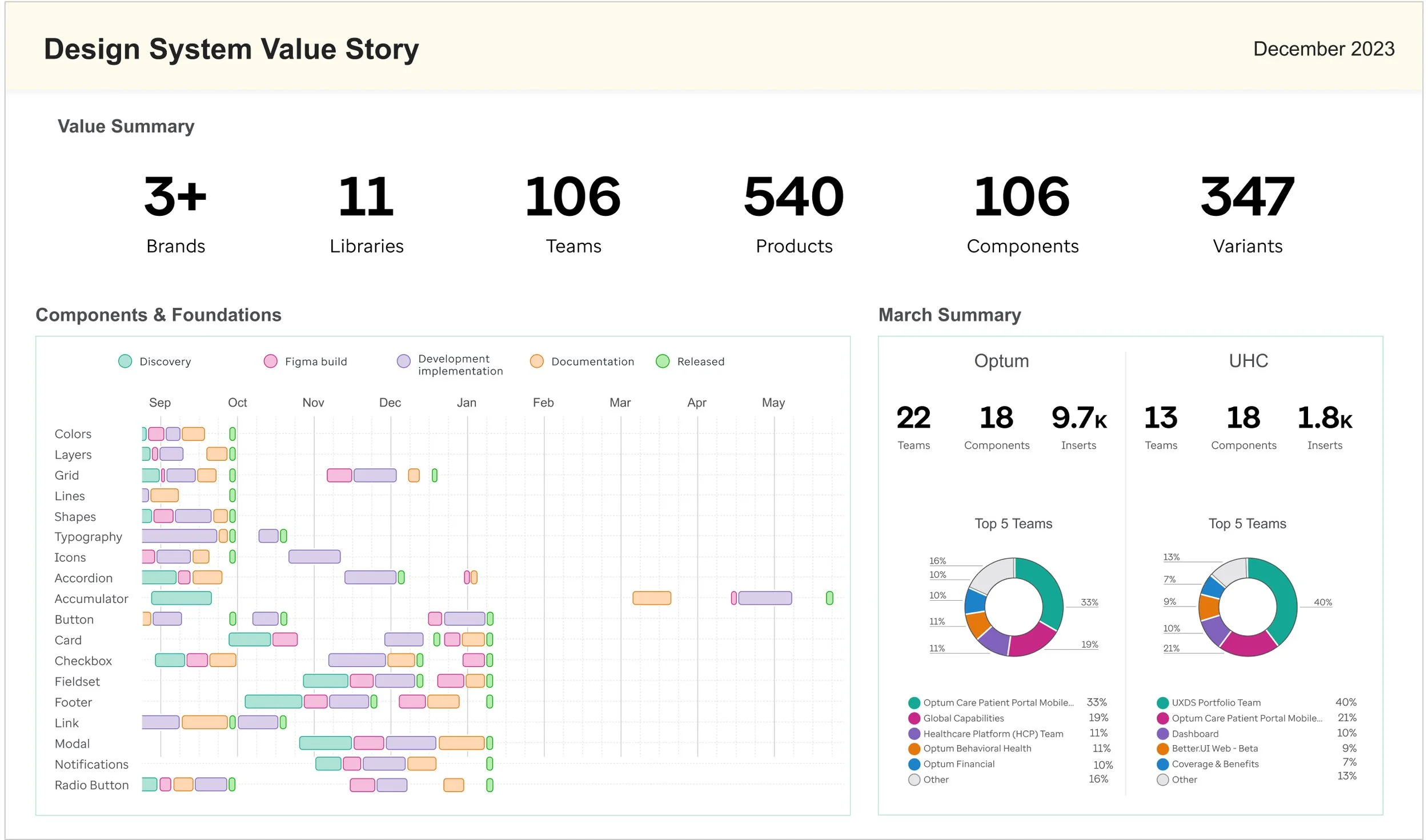
Design System Value Story
How to measure the impact of design, more specifically, a design system.
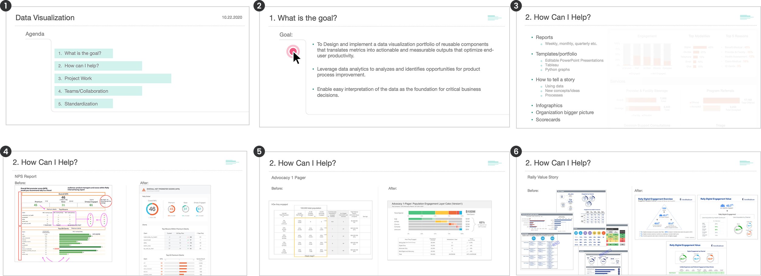
Value Story
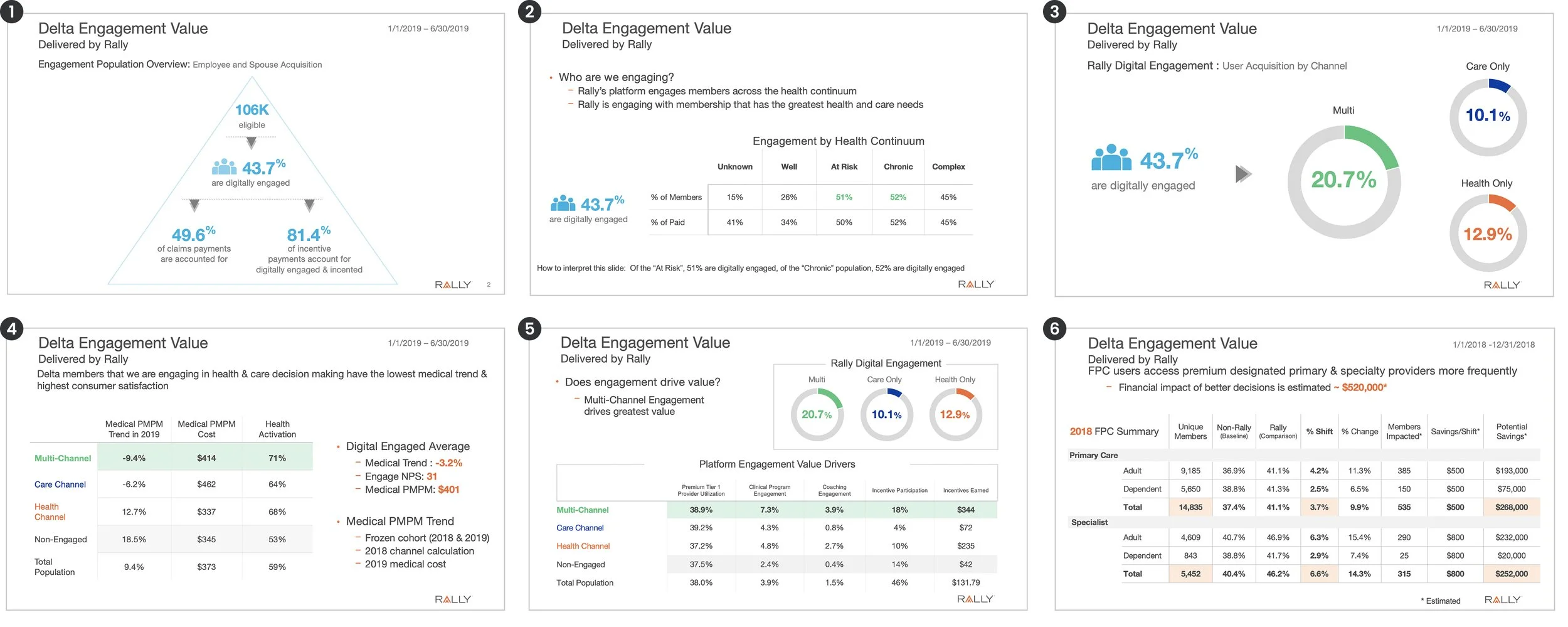
How to tell a story using data. Impact of client engagement.
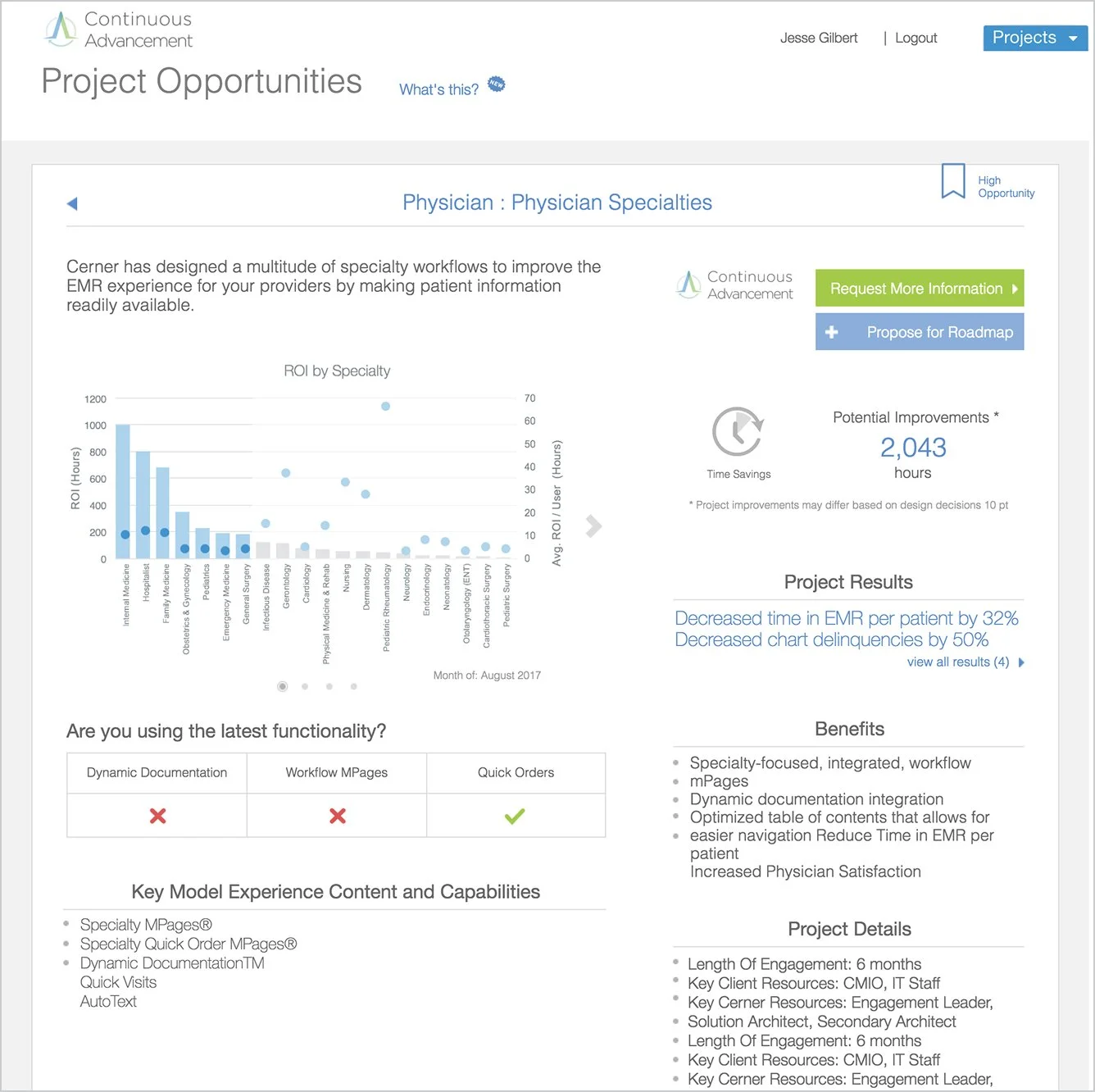
Opportunity Dashboard
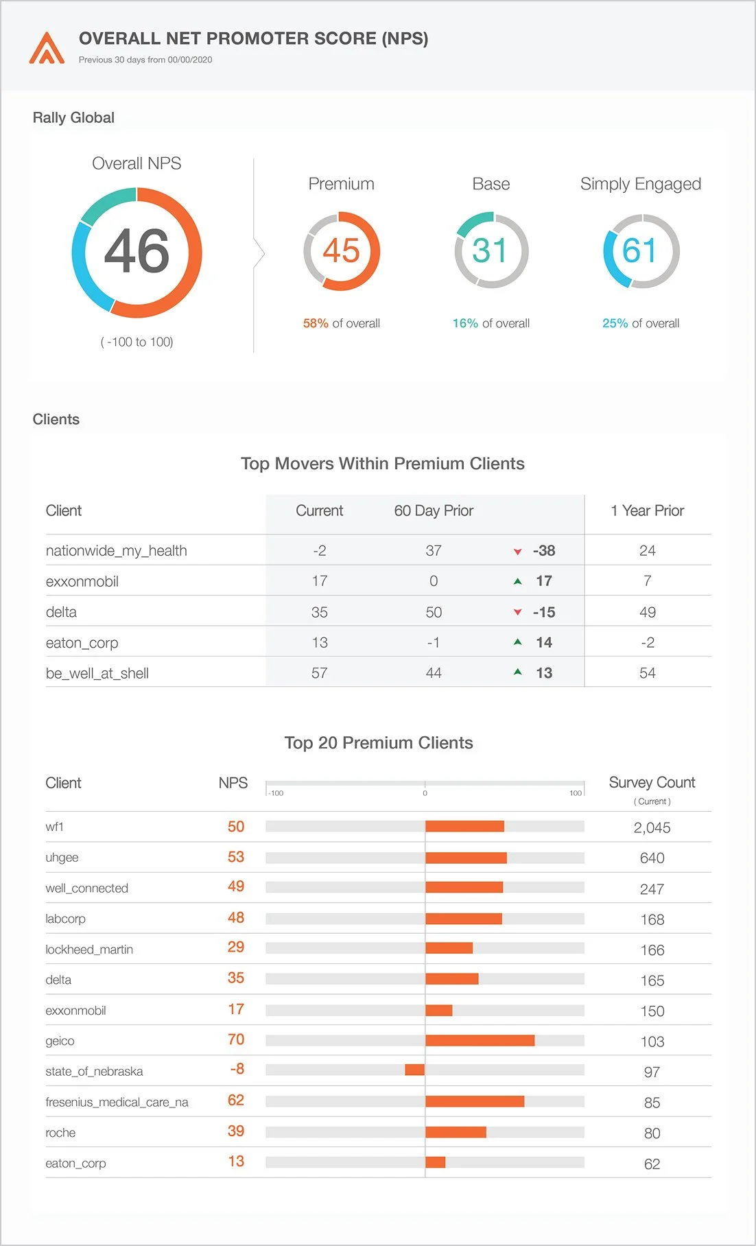
NPS Report
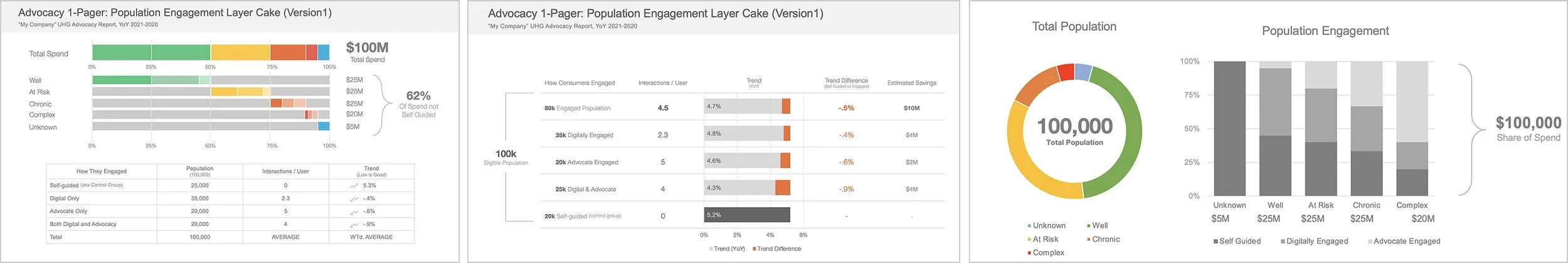
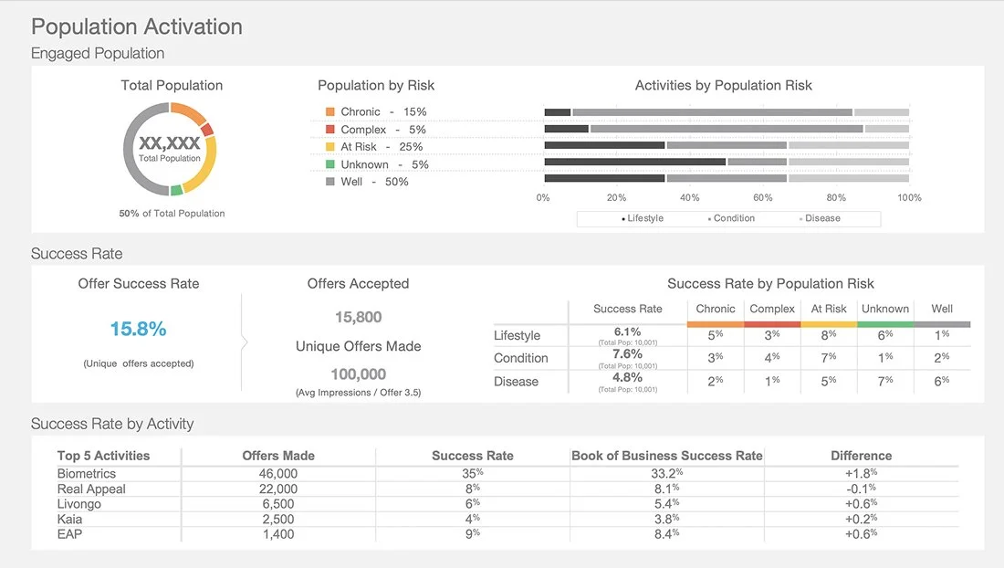
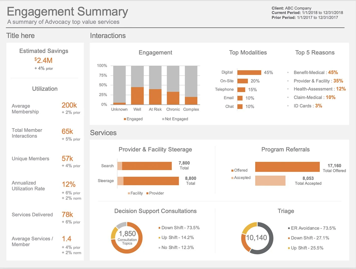
Population Engagement
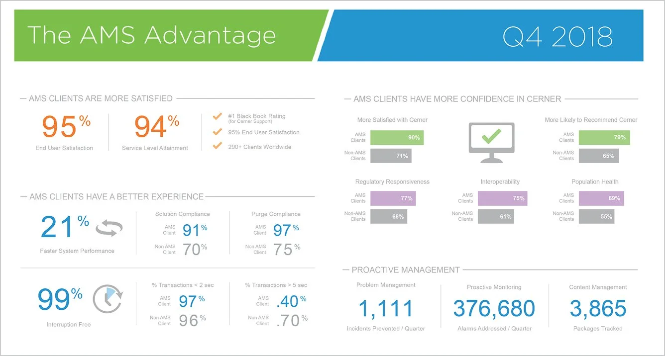
Engagement Advantage
Client Engagement Report
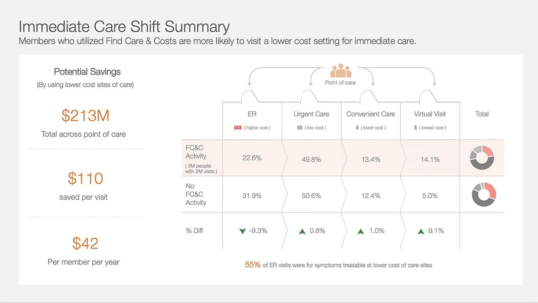
Care Savings Report
Why is data visualization so important?
Let me help tell your story and highlight meaningful data to prove value to end users